Robinhood
Growing Robinhood Gold
Problem: Gold is Robinhood’s paid premium membership. For $5 a month, customers can earn interest on uninvested cash, access premium research and data, and utilize other investing-related benefits. Historically, Robinhood has struggled to effectively market and grow Robinhood Gold in its product surfaces.
Solution: We needed to come up with and design growth experiments to drive Gold subscribers and net deposits, my team’s key metrics.
My role: I partnered closely with Product Management, Product Design, and Data Science to design and iterate on several growth experiments that drove substantial business value.
What I learned: Defining your hypothesis at the outset of a project is important—you can use it as an anchor to understand if your designs are actually aligned with your intent. Additionally, while growth design is incredibly iterative, you should develop an overall strategy as you gather more data about what works and execute that strategy across subsequent experiments.
Strategy
Focus on the gen-pop value prop: The features included in the Gold membership aren’t universally appealing. Our competitive interest rate on uninvested cash was by far the most popular and easy-to-understand benefit, so we focused on finding the right way to communicate the value of that benefit in our upsells.
Meet people in their context: Plug into existing experiences in a way that feels natural and native.
Make the value tangible: In several of our experiments, we leaned into leveraging earnings projections to help users quickly understand the value of Gold in a concrete way. This required a lot of negotiation with Legal and Compliance, but the results ended up being worth it.
Process
When I joined in the fall of 2023, the growth design team hadn’t formalized processes for hypothesis definition, experiment design, stakeholder management, and experiment documentation. I led a workshop with designers across all the Growth teams and then summarized the takeaways from it into a growth design process playbook. This playbook served as an anchor for teams learning to operate in this model and a key onboarding resource for new designers.
I visualized this process as a circle because the latter steps of experiment analysis, documentation, and socialization typically directly influence the team’s subsequent prioritization decision for the next experiment. In the playbook, I wrote up detailed guidance for each step of the process using my experience from being on the team and learnings from the Growth Design course I took in spring 2024.
The hero visual from the growth design process playbook
At a glance, this looks like a lot of steps, but I’ve found that once a team embraces a strong process it begins to feel like muscle memory to move through it. And of course, not every step is necessary or possible for every project. For example, most of the time we unfortunately wouldn’t have UXR bandwidth to do any lightweight testing ahead of an experiment. Despite having an approvals-heavy culture though, our pace as a growth team was overall fairly fast—we’d typically bring an experiment from conception to implementation in 2-3 weeks.
Experiments
Gold native funding upsell
Previous attempts to integrate a Gold upsell into new user onboarding had yielded some incremental success, but we knew that we could drive a lot more impact in such a high-intent flow.
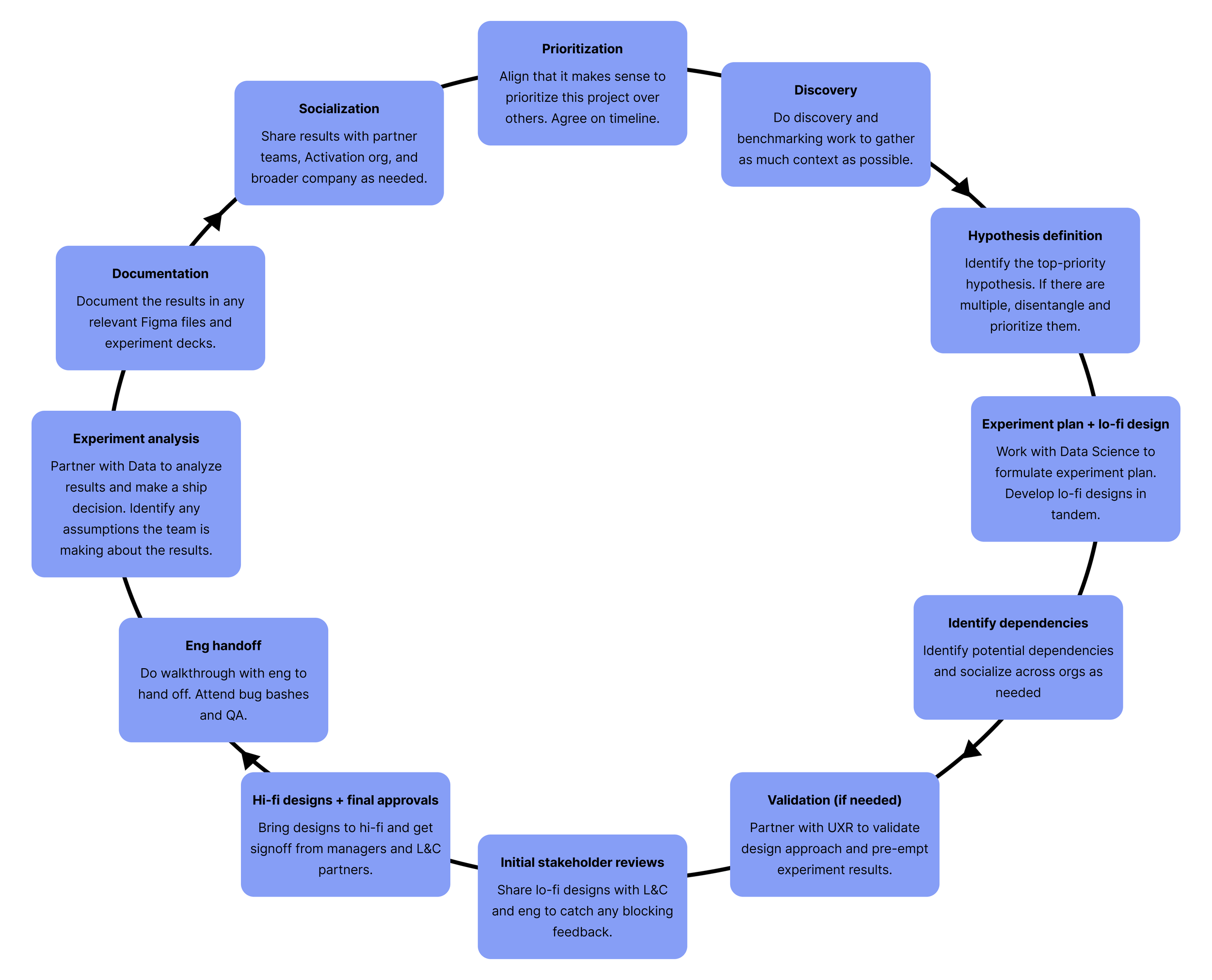
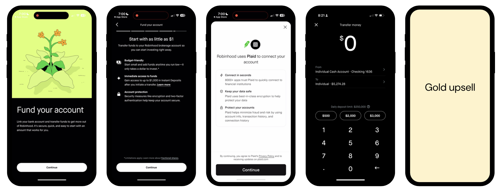
Existing new user onboarding flow structure
Our onboarding flow is structured into different sections that all begin with these chapter header screens. The steps are all pretty functional and in-line with industry standards for a brokerage onboarding flow. The team had previously chosen to slot the Gold upsell after the funding flow, since that made it the last step before the user entered the app.
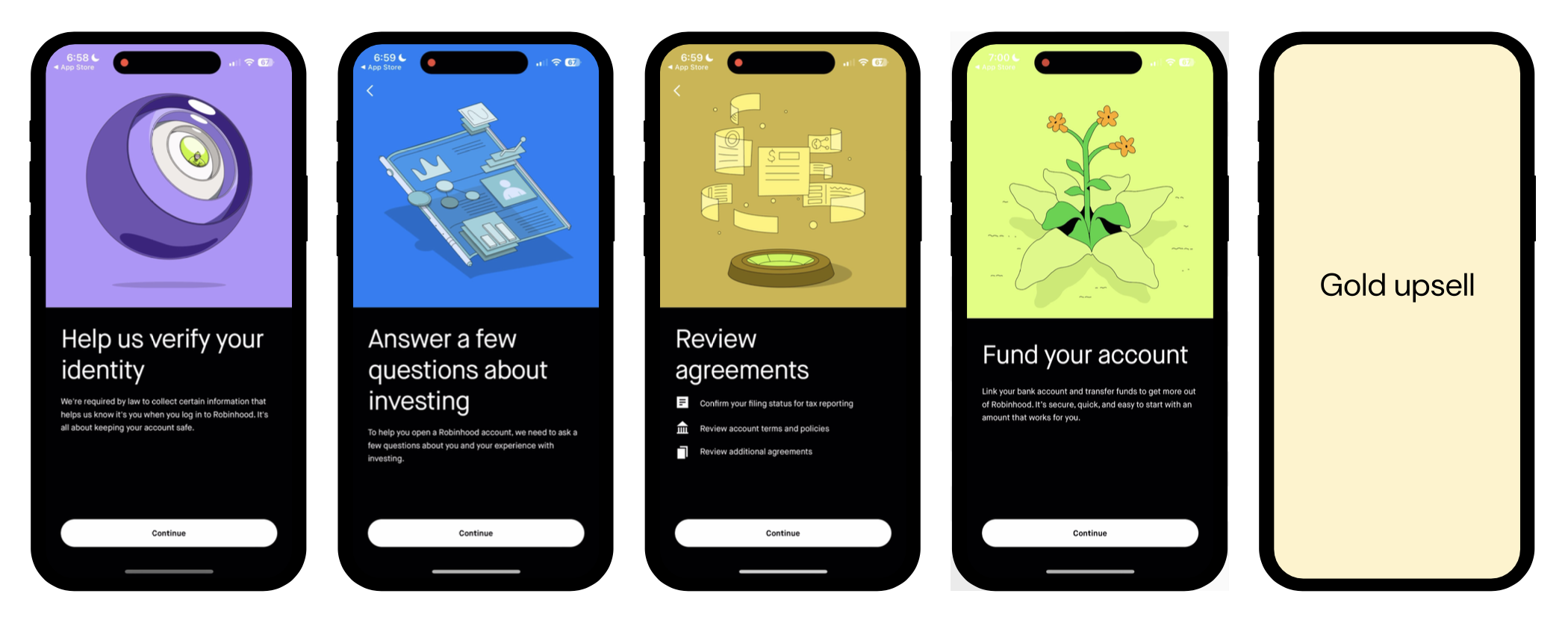
The previous team had boiled down the Gold upsell in onboarding to a more functional choice. Right after a user would make their first deposit, they'd "choose their interest rate." This had been the most successful of the previous iterations, resulting in a 40% lift to Gold adoption in this flow.
In a team brainstorm, I had the idea to find a placement for the Gold upsell within the funding step in onboarding, since this would more contextually present a deposit-related benefit (earning interest) at the moment of making a deposit.
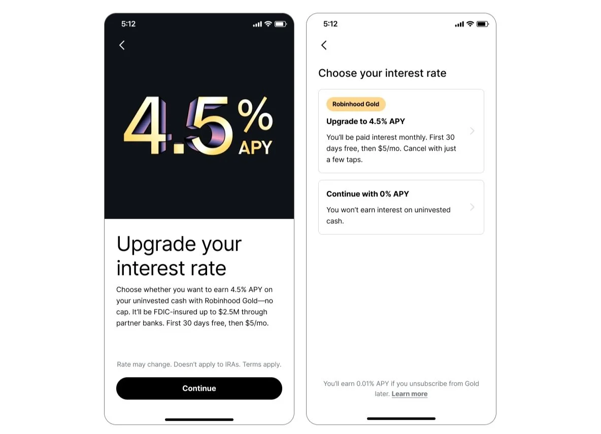
Our funding flow within onboarding. Chapter header ➡️ Expectation-setting screen ➡️ Bank linking ➡️ Deposit step
Hypothesis: If we tie the Gold upsell more closely to funding, more users will sign up for Gold.
Variant 1
First, my product designer suggested leveraging the existing placement, but not segmenting the Gold upsell off with a separate chapter header. Since we had seen previous success with the selector design, she suggested repurposing it, but making modifications to make it feel more contextual within this flow.
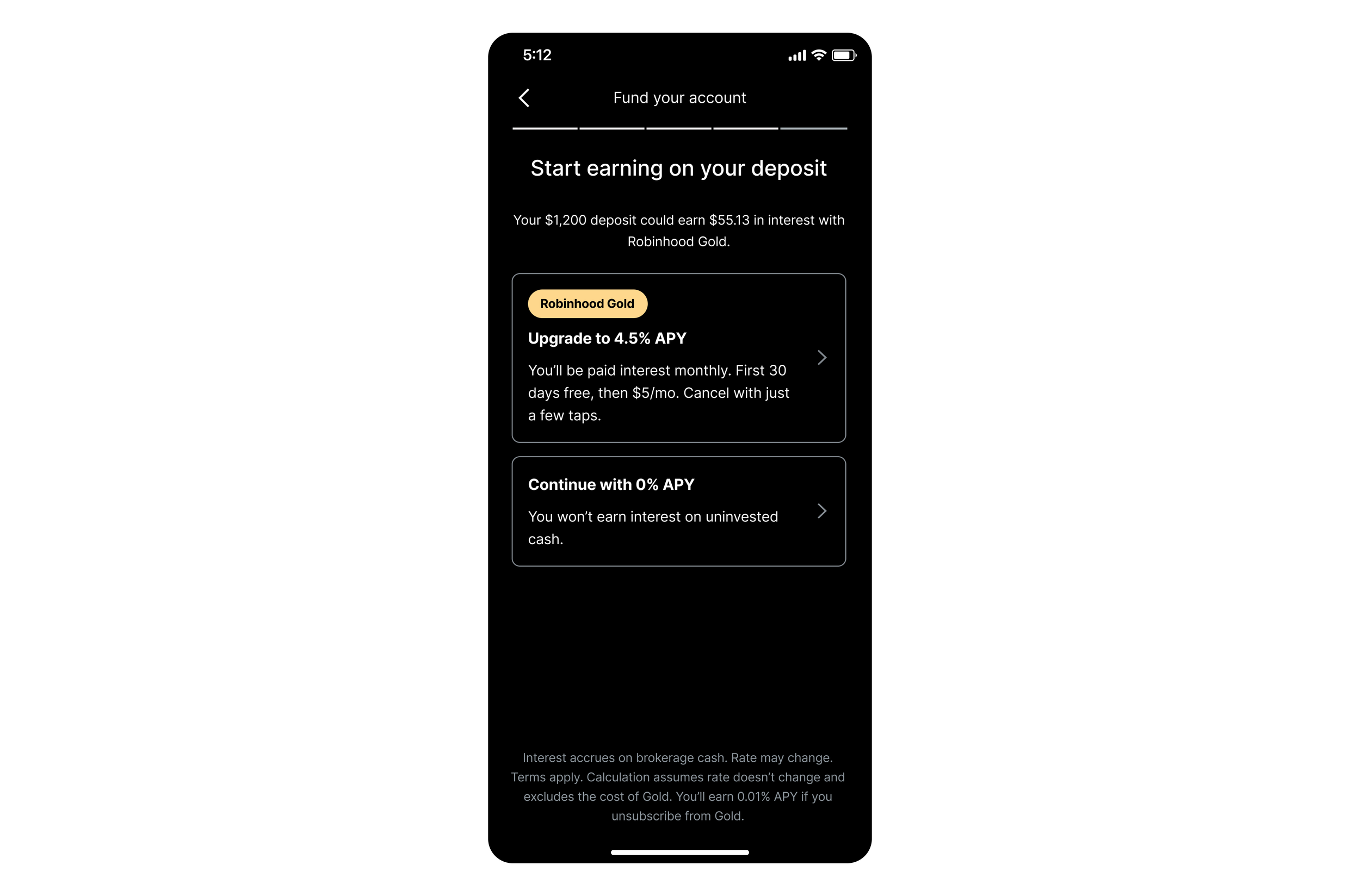
We arrived at this design for the first variant. The center-aligned text and progress bar make it feel like it's still a part of the funding flow, but it uses the same selector design from the previous experiment. The subheader content also highlights the amount they just deposited.
Variant 2
However, I had been trying to think about the funding flow and Gold upsell holistically as an information experience, and I suspected that post-deposit still wasn't the right moment, even if the design felt more native. We were asking users to opt in to a membership that offered significant deposit-related benefits, like APY and FDIC insurance, but we were doing it after they had already put money into Robinhood.
Funding is also our highest-friction part of onboarding, so more people would see the upsell if we moved it earlier, before the user has to make the often-difficult decision of deciding how much to deposit.
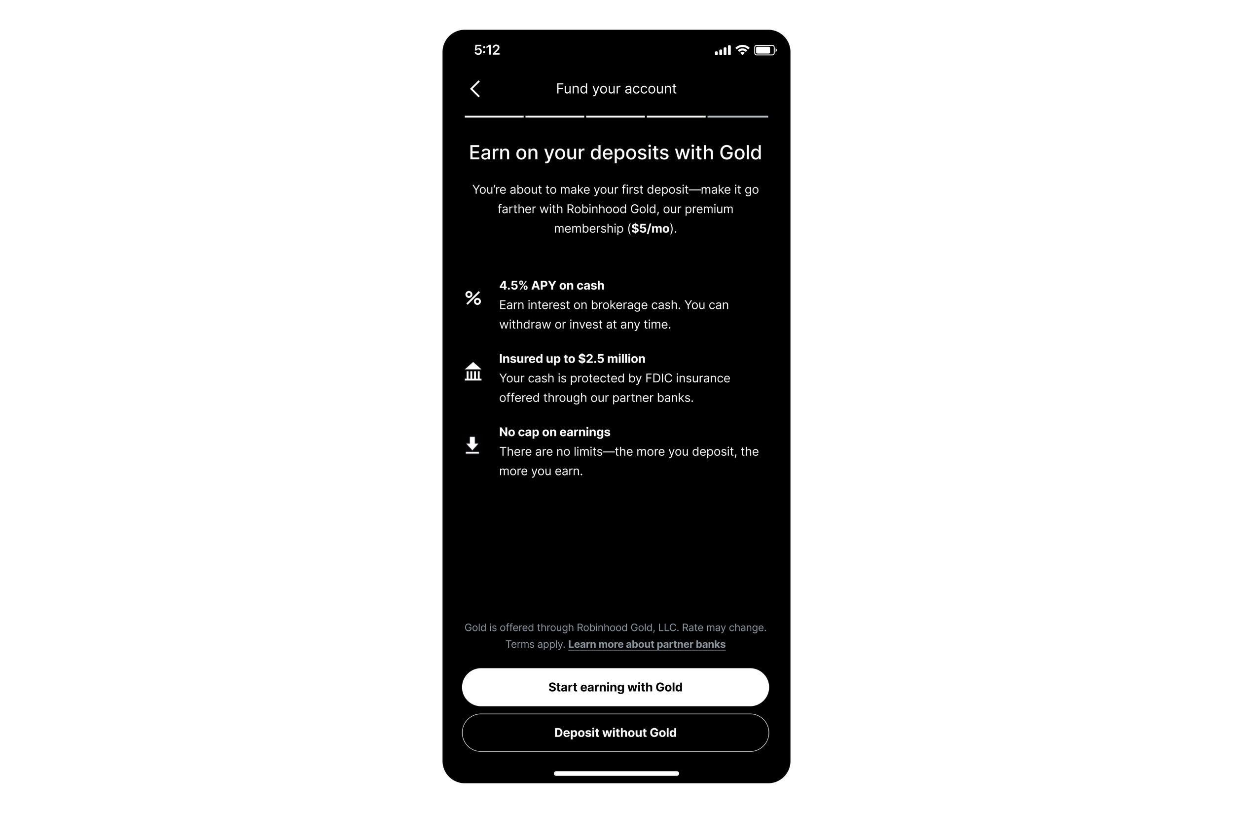
The selector design, however, didn't make sense pre-deposit—you can't ask users to choose an interest rate for money they haven't deposited yet—so I designed this second variant, which reuses existing patterns from the funding flow. The design itself is pretty unremarkable, but I tried to make the content feel contextual by telling users why they're seeing this now ("you're about to make your first deposit on Robinhood—want to take advantage of these deposit-related benefits we have?").
Outcomes
This experiment ended up being our biggest win of the half!
+110% increase in Gold adoption
Variant 2 drove a stat-sig increase of +110% in incremental Gold signups! It also drove a directional increase in first-time deposit amount.
Neutral churn
We were concerned that these results were a result of users not being aware of the fact that they’re signing up for Gold, but we observed that users who signed up for Gold through this upsell didn’t churn at greater rates than users who signed up through other upsells.
Gold earnings calculator for Gold members
After the success we saw with our experiment refining the Gold upsell in onboarding, we wanted to explore ways we could immediately reinforce that the user made a good decision and encourage larger deposits in onboarding.
Hypothesis: If we contextually highlight how much Gold members will earn with Gold’s deposit-related benefits during the deposit step, they’ll make larger deposits.
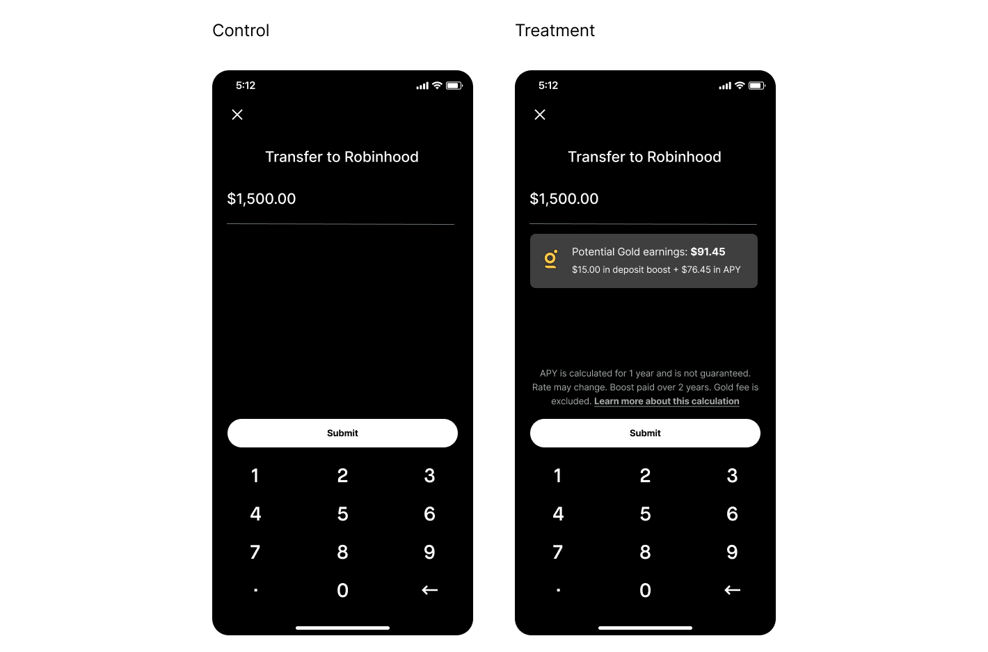
We debated the design here a lot, but ultimately decided on this contextual banner below the text input because it was the least disruptive to the overall structure of the screen. We combined the potential earnings from interest and our 1% deposit boost feature (which has since been deprecated) since they both were deposit-related benefits that would increase in value based on the size of the deposit. Legal and Compliance were pushing us to separate the two numbers, since APY and deposit boost were technically two different programs, but I was concerned that this would be harder to read and less impactful than highlighting one combined figure. We were able to compromise and show a combined number as long as we spelled out the split between deposit boost and APY below.
I labeled the earnings amount as “Potential Gold earnings” as a concession to Legal and Compliance, who required a lot of convincing to get this design over the line. The calculation was an annual projection, and since it was based on a lot of assumptions I worked with them to align on what disclosure needed to be on the screen, and what disclosure could be behind a tap. I focused on communicating the constraints of the design (we couldn’t have more than 3 lines of disclosure text directly on the screen) and working with them to make the disclosure as conversational and concise as possible.
Outcomes
It seems like we accomplished our goal of getting users to increase their initial deposit amount! For users with more than $1K in their linked bank account, our design increased net deposits by 3-7%. For users with more than $2K in their account, we increased net deposits by 5-10%. We had to re-run the experiment after we deprecated the 1% deposit boost feature, but we were able to replicate the positive results we observed in the first version of the experiment.
Gold earnings calculator for non-Gold members
Since we saw so much success with making the value of Gold tangible in the previous experiment, we wanted to see if we could extend this strategy to drive Gold signups as well. However, because our onboarding upsell was performing so well, we took a closer look at the deposit flow for existing users instead.
The deposit input screen design in the transfers flow was much different than in onboarding, so we didn’t have the real estate to insert the same banner and disclosure we had designed previously. The transfers flow was also much more sensitive than onboarding because it’s a higher-traffic flow, so the team that owned it didn’t want us making any major changes within the flow that might harm their metrics.
Ultimately, my product designer and I decided to use a contextual bottom sheet that would appear after the user had completed their transfer. We also wanted to make sure we were showing this message only when it would be relevant to users, so we segmented the audience based on a user’s deposit amount. We decided to only show the bottom sheet if a user deposited an amount that hit the “Gold breakeven point”—the amount at which the user would “break even” with interest income on the $5 monthly fee (around $1,100 at the time). This ensured that we were showing the Gold upsell to the users it was most relevant to, and not spamming users who wouldn’t get value out of Gold.
Hypothesis: If we surface a Gold earnings projection to users who just made a sizable deposit, more of these users will adopt Gold.
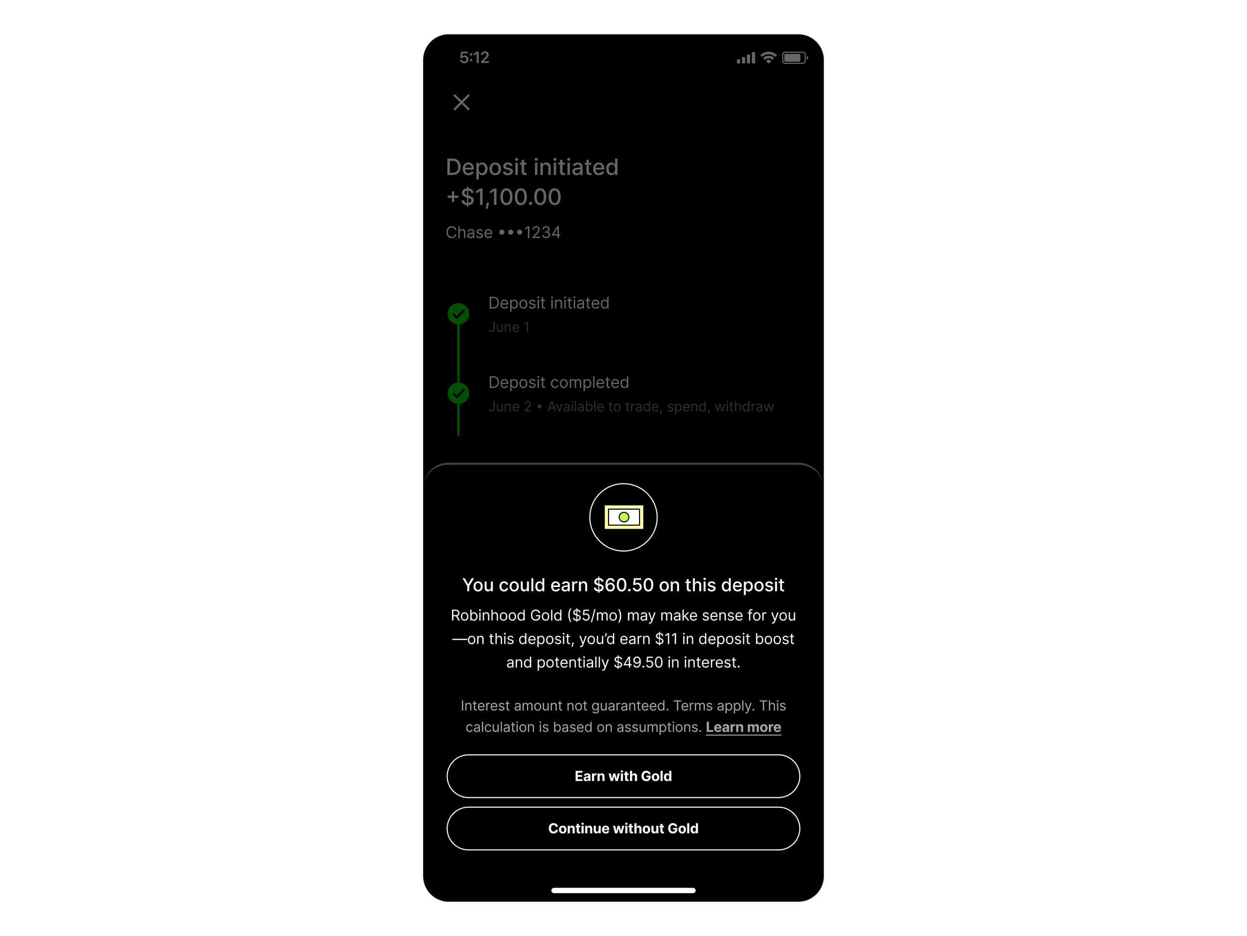
In terms of the content design, I worked with user research to design an unmoderated survey and test a different content variant that explained how Gold could “pay for itself” since the user would out-earn the $5 monthly fee. However, we observed in the responses that it was creating too much cognitive load and mental math for users, so I ultimately went with this more straightforward message in the experiment.
Again, because we were relying on an annual earnings projection, Legal and Compliance were wary of being too promissory here. I balanced adding in hedging language (“you could earn", “may make sense for you,” “potentially”) to assuage their concerns while still being clear about the user benefit. For the CTAs, we’ve learned over several experiments that value-based CTAs consistently perform better, so the primary CTA “Earn with Gold” aligns with that strategy. “Continue without Gold” dismisses the bottom sheet and allows the user to progress through the rest of the transfer flow.
Outcomes
+3.49% in Gold adoption
This was statistically significant.
+0.91% in incremental net deposits
We drove a slight increase in users’ deposit amounts after seeing this upsell. This was directionally positive, but not statistically significant.