Robinhood
Onboarding redesign
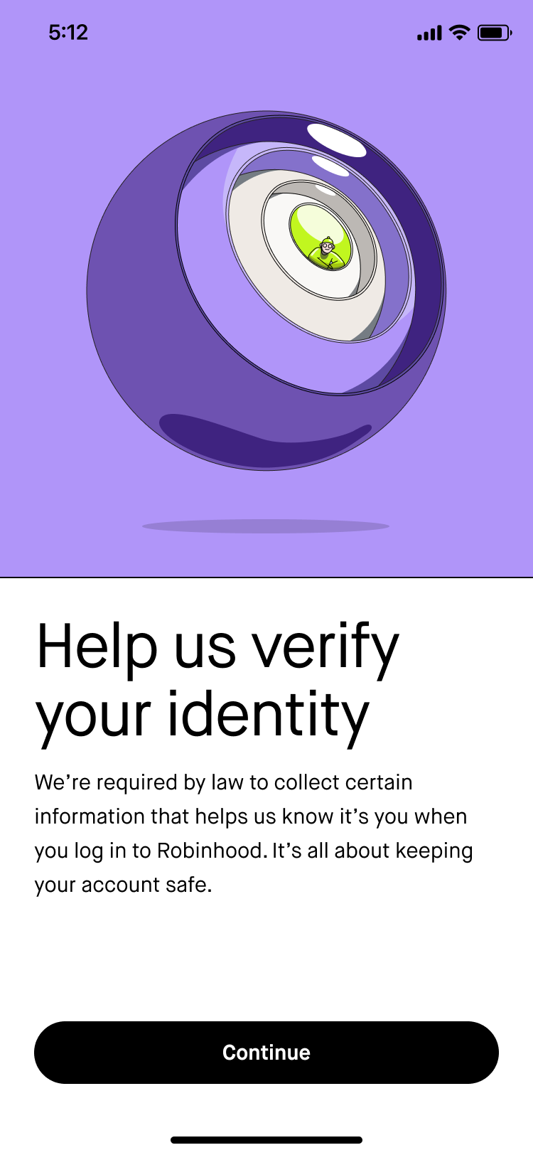
Problem: The Robinhood onboarding flow was long, not structured well, and hadn’t evolved to represent our current product offering. We were seeing a lot of drop-off at key points in the flow. It also didn’t reflect how our visual branding and content standards had changed.
Solution: They say you never get a second chance to make a first impression, so we wanted to put our best foot forward by restructuring the onboarding flow and refreshing the visuals + content to be more in line with our 2022 brand identity and content standards.
My role: Drove UX content design, solicited and responded to stakeholder feedback, secured Legal and Compliance approvals, and communicated implementation details to frontend engineering
What I learned: I was brought into this project later than I would’ve liked. The onboarding team had been operating without content design support for a few months at that point, so the product designer had forged ahead and the visual design + structure of the screens were pretty much locked by the time I got involved. While this isn’t my ideal working model, it was still a challenge to define how we wanted to introduce our product offering and properly set expectations for a long flow. I saw that content can still have an impact, even later in the design process.
-
![]()
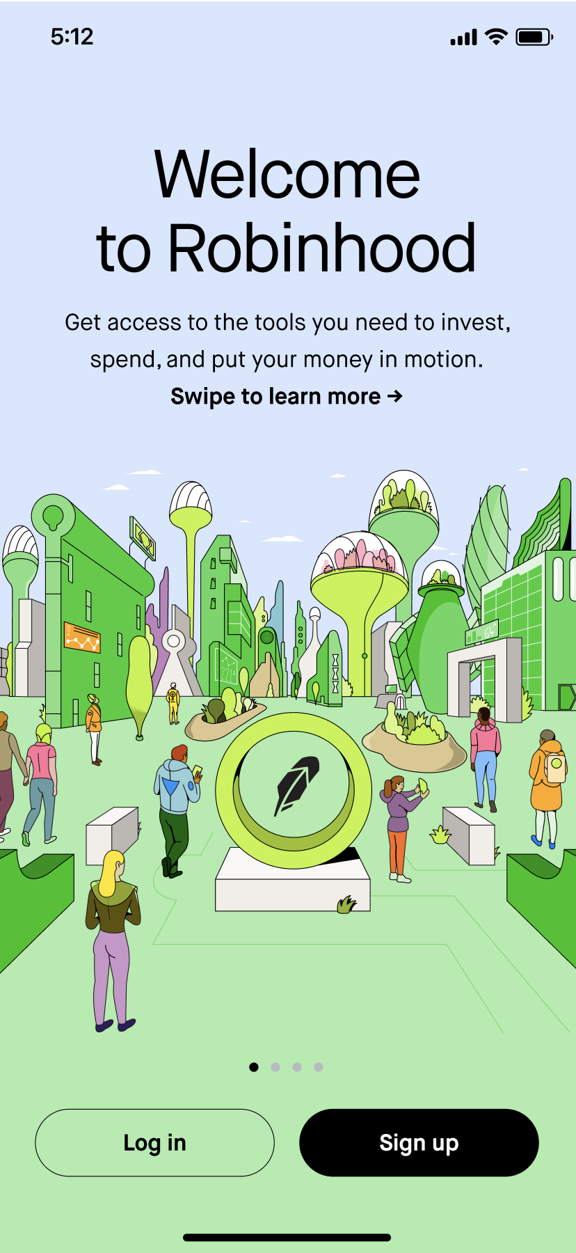
Welcome
Content goal: Invite the customer in and give them a high-level overview of what Robinhood has to offer without getting too specific.
Implementation: “Welcome to Robinhood” greets the user and aligns with the illustration welcoming them into an imaginary city. “invest, spend, and put your money in motion” nods to how Robinhood is an access brand and calls out our investing and spending products.
-
![]()
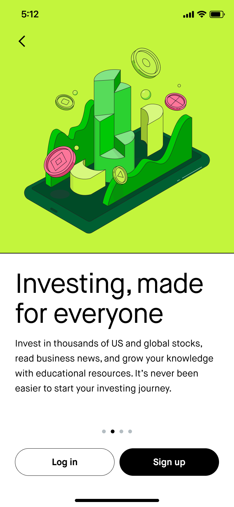
Investing value prop
Content goal: Give the customer an overview of our investing products. Avoid mentioning crypto for compliance reasons.
Implementation: Mentioned stocks first, since that’s what people know Robinhood for. There’s also a large segment of active users who just use Robinhood to read business news, so prioritized mentioning that second. Then I called out Robinhood’s educational resources to appeal to newer investors and signal that we can support them. Robinhood tries to position itself as the best place for beginners, so I drove this home with “It’s never been easier…”
-
![]()
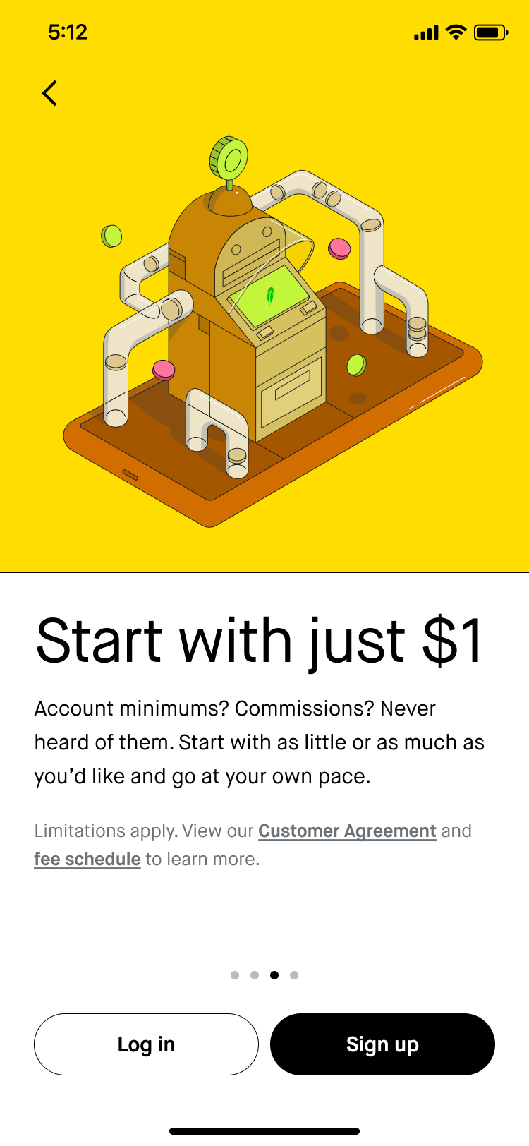
Access value prop
Content goal: A lot of customers come into Robinhood with a trial mentality, so I wanted to emphasize that it doesn’t take much to get started to help them take that first step.
Implementation: “Start with just $1” is concise and conveniently fits on one line, which is great with the longer disclosure text above the CTAs. Tried to make the tone in the subheader lighter with “Account minimums? Commissions? Never heard of them.” Emphasized how the customer is in control with the second sentence of the subheader.
-
![]()
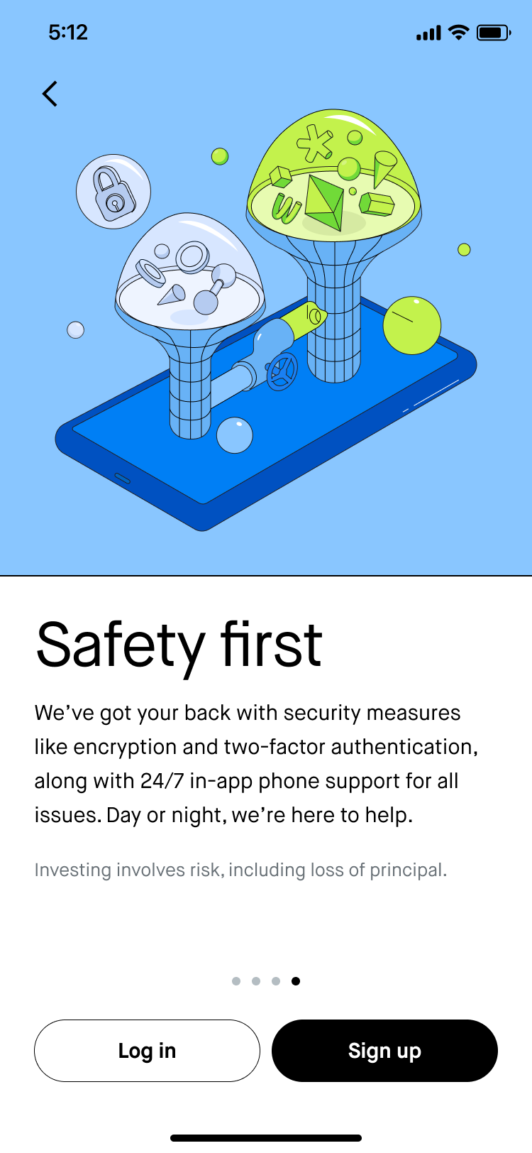
Safety value prop
Content goal: Start to build customer trust by explaining the safeguards that we have in place. Our net promoter score took a hit during 2021 due to trading restrictions, outages, and data leaks, so it’s important to emphasize how we’ve invested in security and safety measures upfront.
Implementation: “Safety first” is actually one of our company values that we’ve repeated a lot in external messaging. “We’ve got your back” helps strike a casual tone. Mentioned security measures we’ve implemented recently (“encryption and two-factor authentication”). “24/7 in-app phone support for all issues” was a huge launch for us last year, so I wanted to make sure that was featured here as well. “we’re here to help” is how our customer support agents typically close their emails, so it seemed fitting to tie that in here.
-
![]()
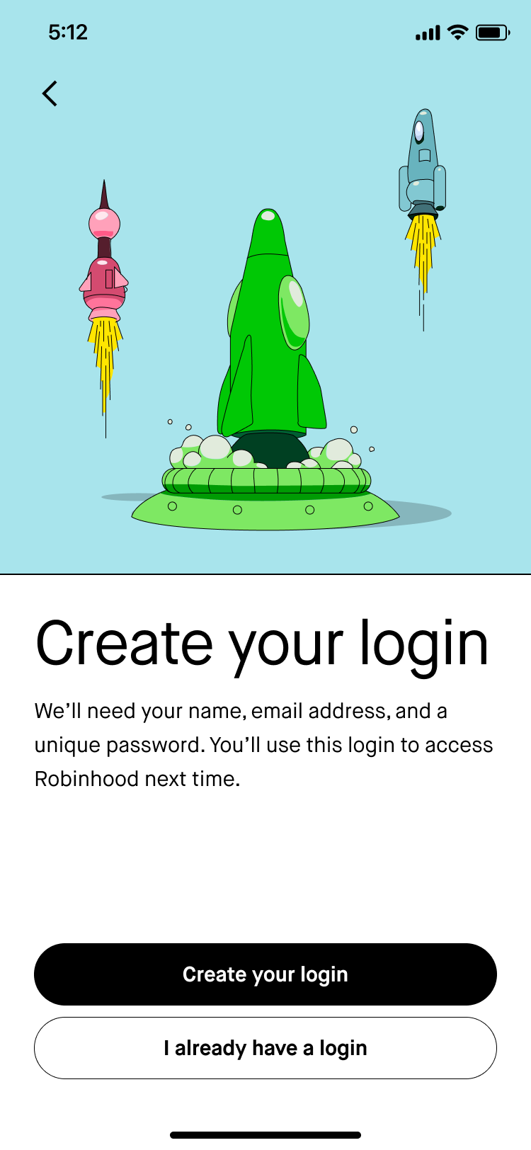
Create login
Content goal: We called these screens “chapter headers” because they group each section of the flow. The overall goal for each one is to set expectations for what the customer will do in that section of the flow and contribute to a sense of progress. For this section, the customer is just going to enter their email, preferred password, and legal name.
Implementation: “Create login” encapsulates the first 2 steps of this section of the flow. I couldn’t say “Create account” because I wanted to future-proof for when Robinhood will offer multiple accounts that the customer will be able to access with one login. “You’ll use this login to access Robinhood next time” signals to the customer that they should keep this information handy for the next time they log in.
-
![]()
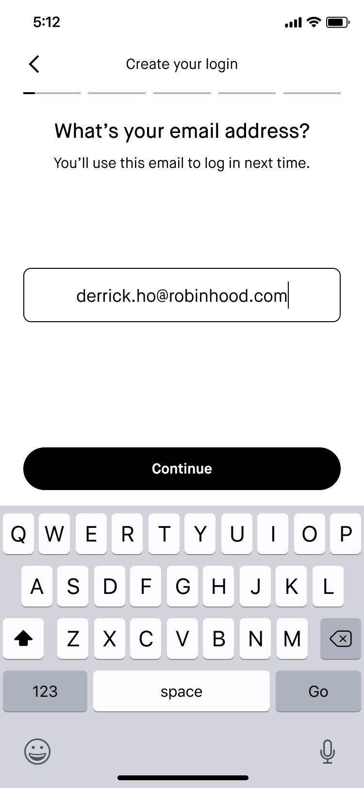
Input email
Content goal: I wanted all of the steps in each section to be consistently phrased as an imperative or a question so it was clear what we were asking of the customer. Where applicable, I also wanted to give the customer insight into why we were asking these questions.
Implementation: Some of our questions—like asking for the customer’s email address—are pretty self-explanatory. The subheader here sets expectations for how the customer will use their email the next time they log in.
-
![]()
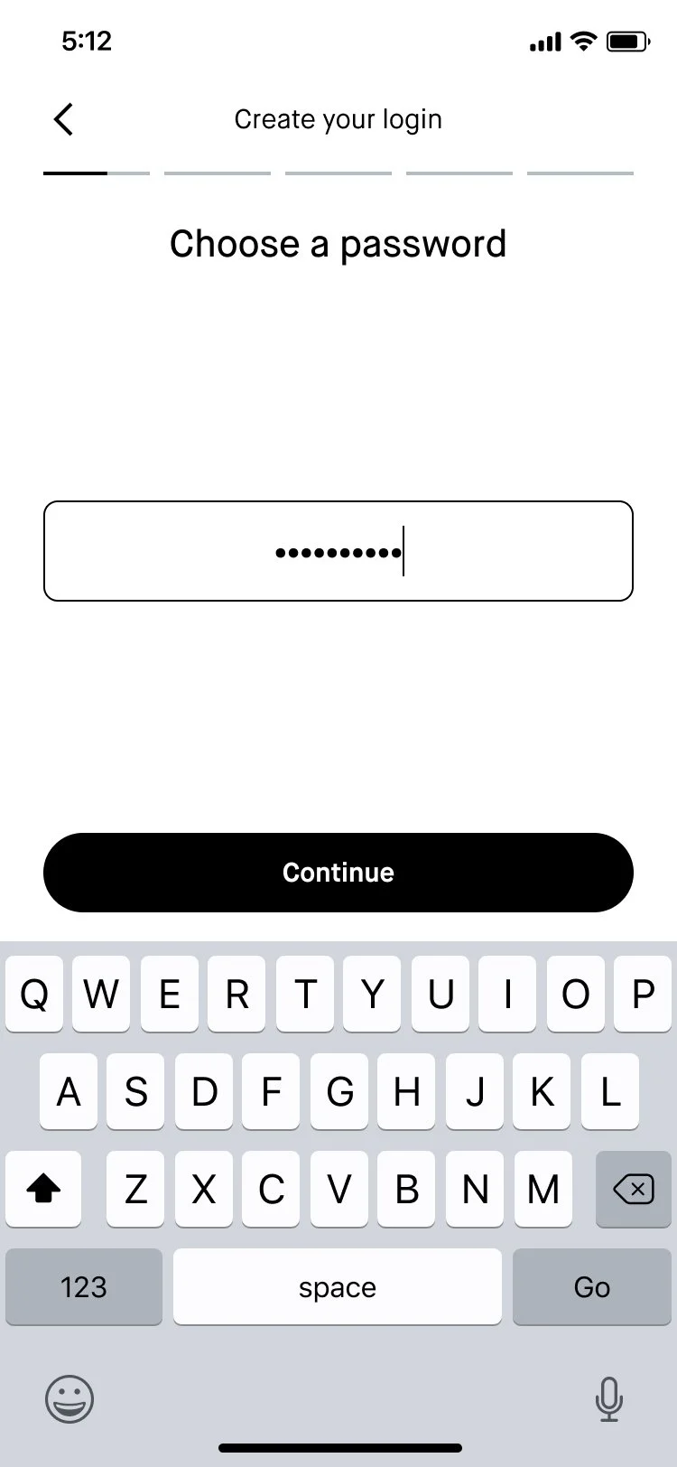
Choose password
Content goal: Make it as easy as possible for the customer to choose a password.
Implementation: Using “Choose” as the verb here helps the customer know that we’re asking them to come up with something new. Ideally we would’ve used the subheader space to provide guidance on any requirements (i.e. how many special characters they need), but we actually don’t have any. 😅 I believe that’s in the works though, so I left the subheader blank here to reduce friction for now.
-
![]()
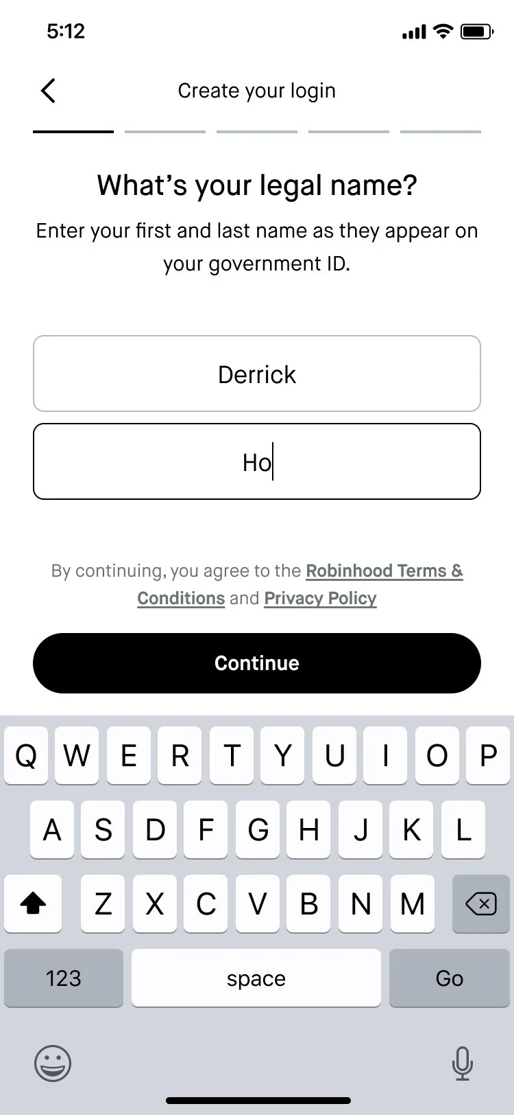
Input legal name
Content goal: Help the customer understand what we’re asking them to input at this step.
Implementation: “as they appear on your government ID” clarifies that this should be the name that the US government knows them by. I also had to work with Legal and Compliance to add button bar text with links to our T&C and privacy policy, since account creation technically happens after the customer proceeds past this screen.
-
![]()
Identity verification chapter header
Content goal: Signal to the customer that we’re going to ask them to fill out a lot of information for legal reasons, and that it’s all in the name of keeping their account secure. We don’t want the customer to feel like we’re suspicious of them, so we should communicate that this is all pretty standard stuff.
Implementation: “Help us” makes the header an imperative, which is consistent across all of these chapter header screens. In past UX research, we’ve observed that customers are generally understanding when we mention that we’re collecting information for legal reasons, so I figured it would be good to lead with that in the subheader. I also tried to give them some insight into the “why” here—it “helps us know it’s you when you log in to Robinhood” and “It’s all about keeping your account safe.”
-
![]()
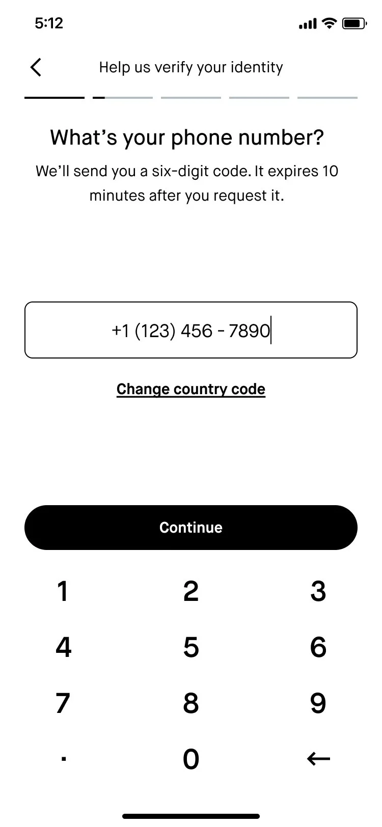
Phone number
Content goal: Ask the user for their phone number and set expectations for what will happen next as we verify their phone number.
Implementation: Reframed the header as a question. “We’ll send you a six-digit code” tells the customer what to look out for. “It expires…” lets them know that it’s time-sensitive.
-
![]()
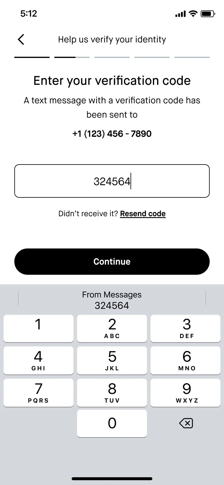
Phone number verification
Content goal: Instruct the user to enter their verification code.
Implementation: Used “Enter” imperative for header. Reiterated what just happened in the subheader. Used text below input field to help users re-send the code if they didn’t receive it.
-
![]()
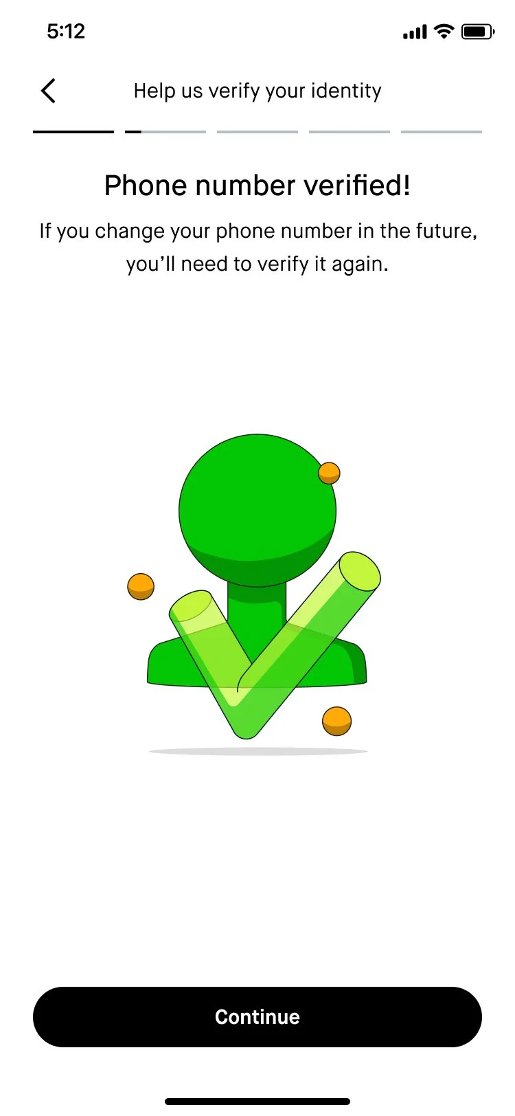
Phone verification successful
Content goal: Let customers know that their phone verification was successful.
Implementation: We were previously using a generic message (“Success!”) for the header, so I rewrote it to specifically reflect the action that the customer took. The subheader sets expectations about how the customer will need to take this action again if they ever reset their phone number.
-
![]()
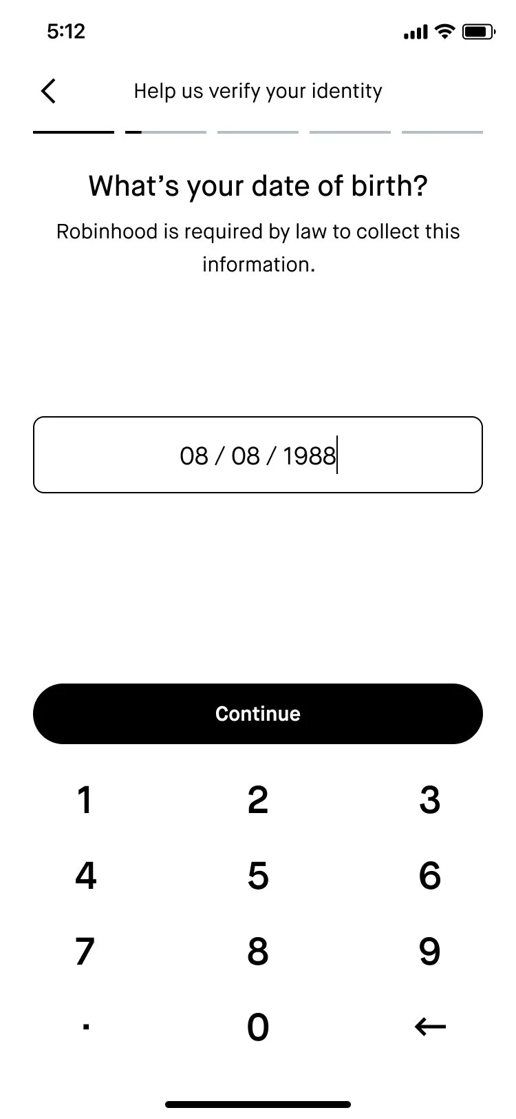
Input date of birth
Content goal: Prompt the customer to input their date of birth and let them know why we’re asking about it.
Implementation: Like other similar screens in this flow, I used the subheader space to reiterate why we’re asking for their date of birth. I also continued to use contractions (“What’s”) to help strike a more conversational tone.
-
![]()
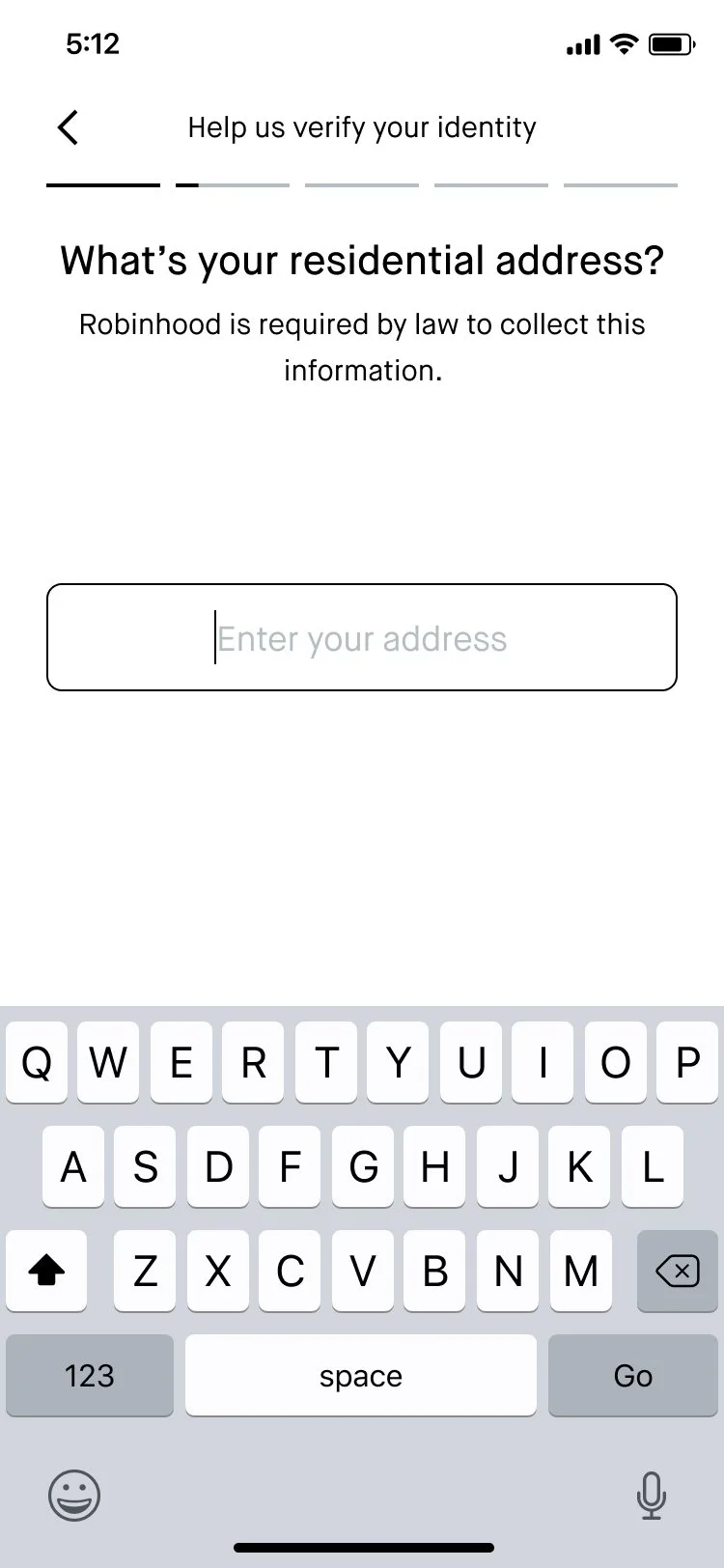
Input residential address
Content goal: Prompt the customer to provide their residential address.
Implementation: “residential” carries the weight of communicating that this is the address where the customer lives. Since this is a pretty sensitive piece of personal info, I reused the same subheader from previous screens to reiterate that this question is required by law.
-
![]()
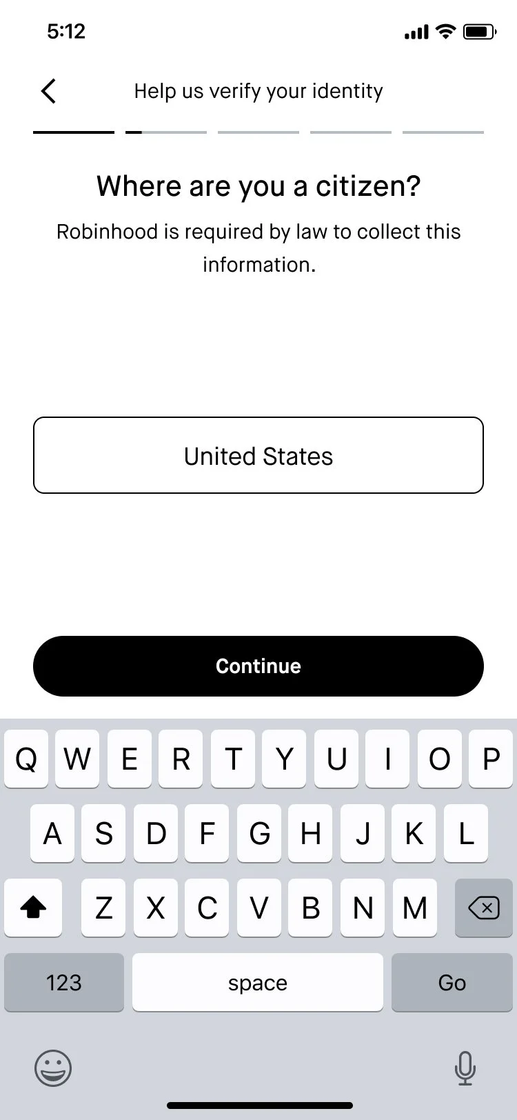
Input citizenship
Content goal: Have the customer tell us where they have citizenship.
Implementation: This screen previously had a generic header (“Citizenship”), but I reframed it as a question to strengthen the conversational tone of this flow and create parity across questions.
-
![]()
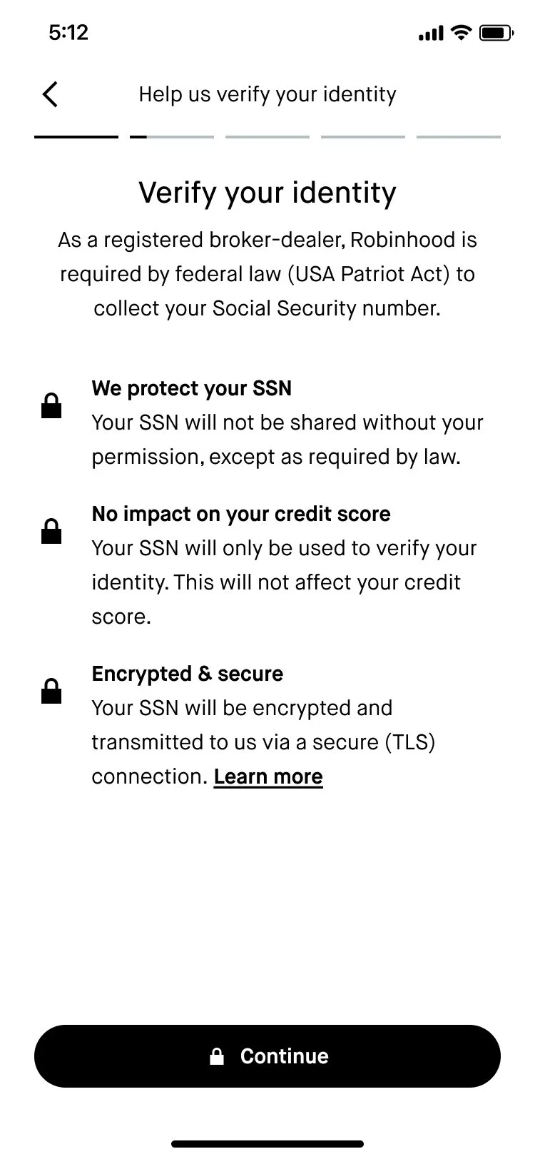
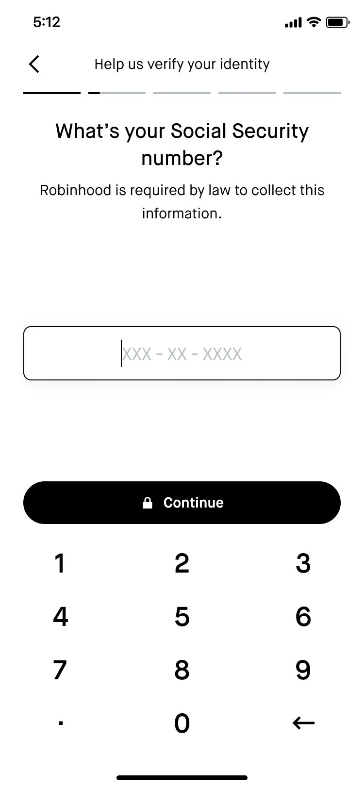
SSN primer
Content goal: According to our user research, out of all the pieces of personal info, SSN is the most sensitive. The goal of this screen was to prepare the customer to input it by explaining why we ask for it and how we keep it safe.
Implementation: Kept the header more generic (“Verify your identity” instead of “Provide your SSN”) to focus the screen on why we’re asking for SSN. The subheader is more specific about which federal law requires us to collect this information, so the customer can research it on their own if that helps them feel better. The three bullet points address common concerns we heard from customers around how their information would be protected and if providing it would impact their credit score. Even though providing SSN is a pretty standard part of opening a bank or brokerage account, we wanted to design for the customer who hadn’t done this before and would have questions.
-
![]()
Input SSN
Content goal: Prompt the customer to input their SSN.
Implementation: Our hope was that the trustbuilding on the previous screen would make this step easier for the customer, but just in case I used the subheader to reiterate the required nature of this step.
-
![]()
Investing questions chapter header
Content goal: Get the customer ready to answer a series of investing-related questions.
Implementation: These questions didn’t fit neatly into one category. Internally, the team called this the “investment profile” section because it includes one investment profile question (the investment profile is a specific set of investing-related questions that regulators require us to ask once the customer has an approved brokerage account), but I wanted us to be more encompassing with how we were grouping these questions so we weren’t misusing terminology. I made the header more vague (“questions about investing”) and tried to summarize themes from the 4 questions in the subheader. And once again, I reiterated that this section is also required by law.
-
![]()
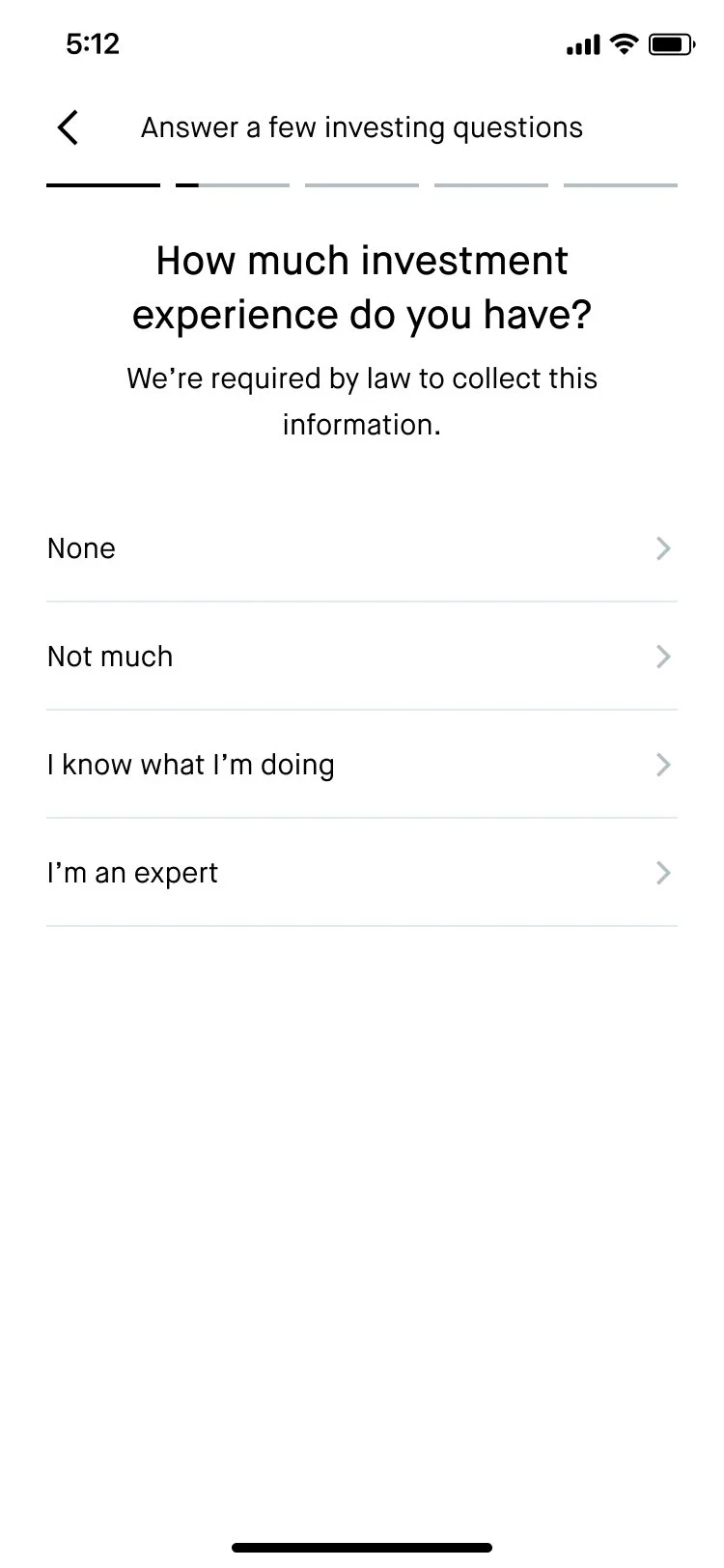
Share investing experience
This screen wasn’t in scope to change for this project. However, I did work on another project where we had the opportunity to revise this question—will share it in my portfolio in summer 2022 after it ships!
-
![]()
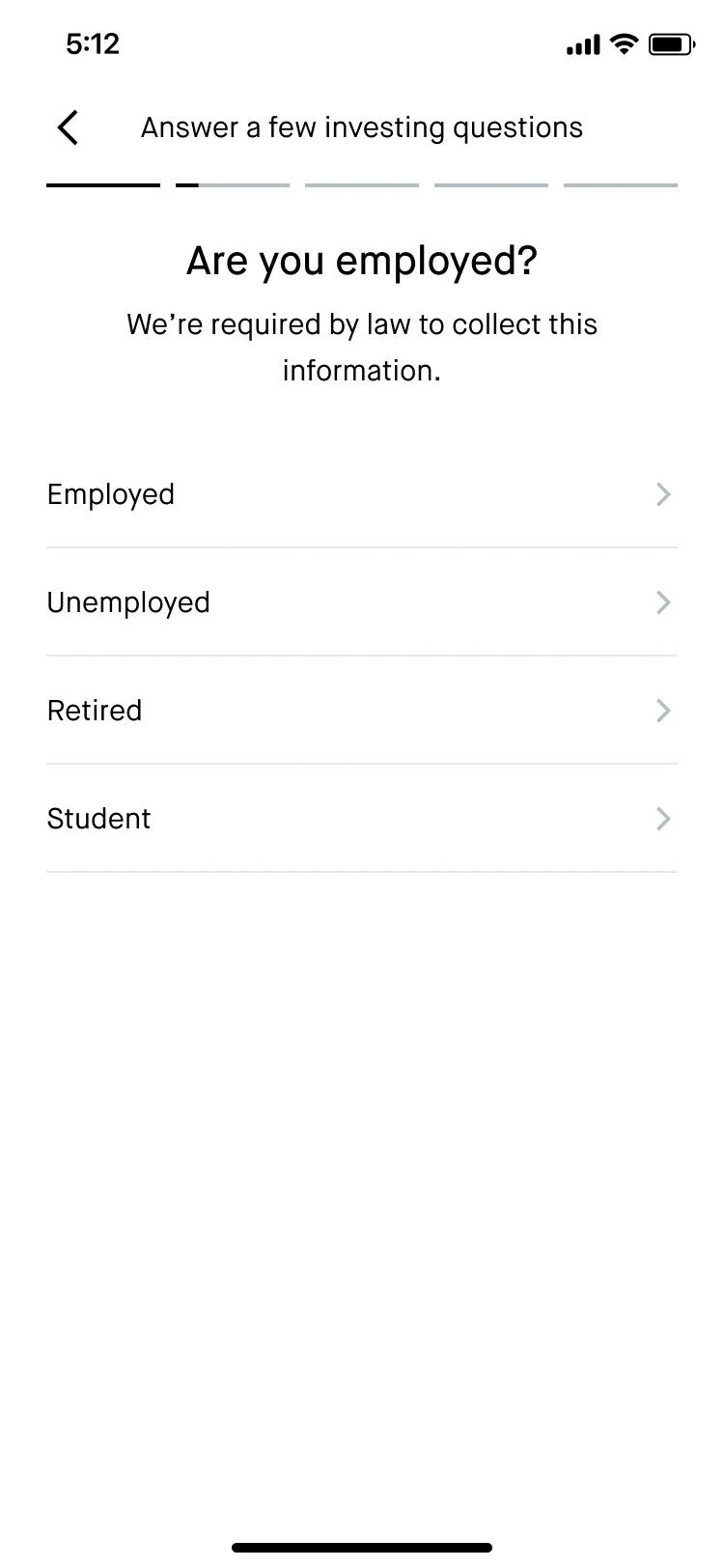
Share employment status
This question also wasn’t in scope to change for this project.
-
![]()
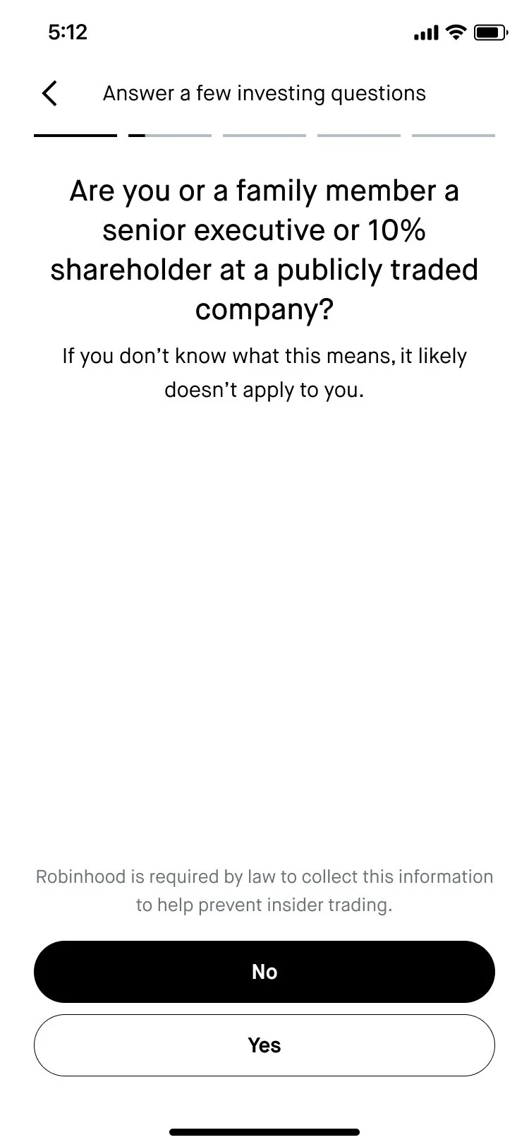
Insider trading flag
Content goal: Ask the customer if they have any large stake in a publicly-traded company. This question is required by insider trading laws.
Implementation: We had to use a lot of technical words in the header, so I used the space in the subheader to help reassure the customer that if they aren’t sure what the header means, they likely don’t have to worry about this question. We also positioned “No” as the default answer by making it the primary CTA, since that’s what most people answer here.
-
![]()
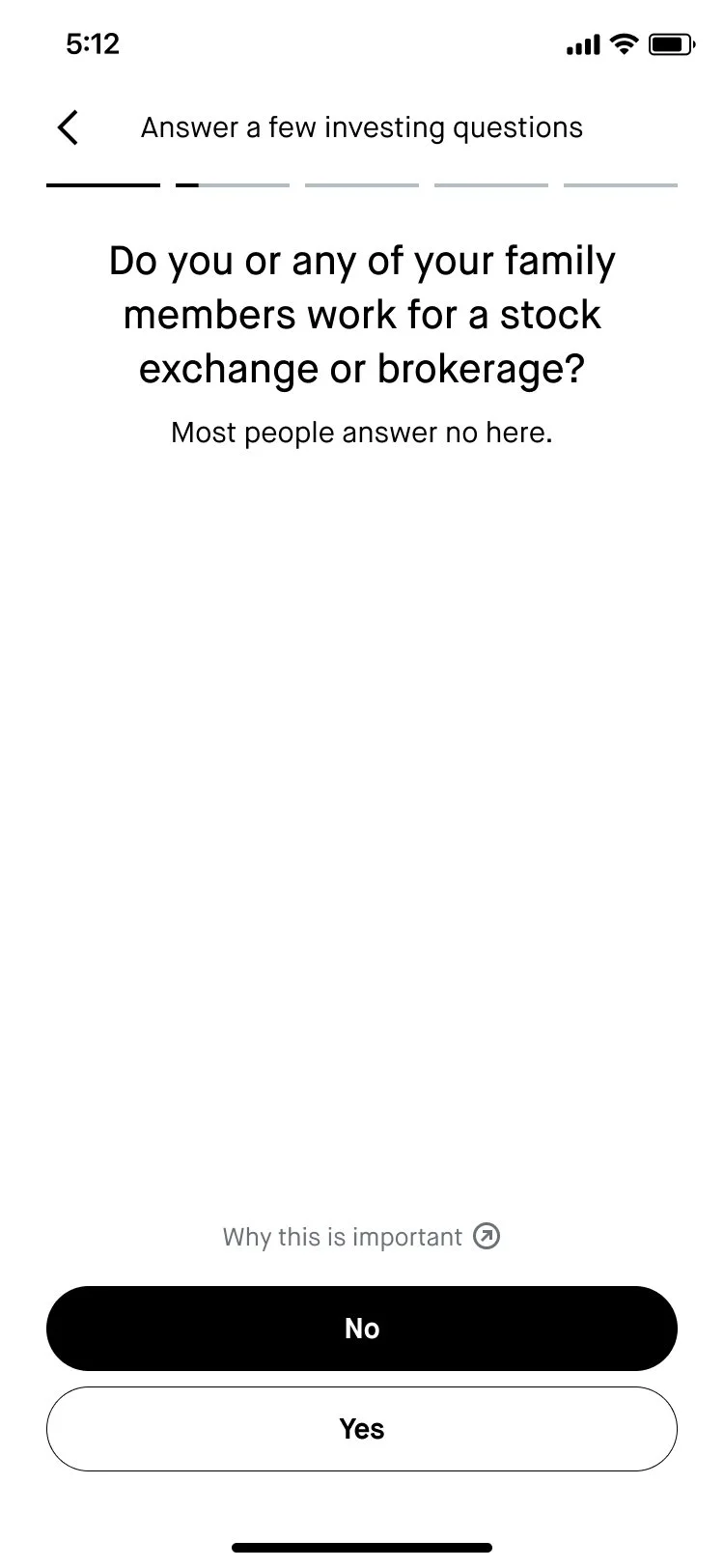
Brokerage affiliate status
Content goal: Ask the customer if they’re affiliated with a stock exchange or brokerage firm.
Implementation: Clarified in the header that even having a family member who is a brokerage affiliate is relevant. However, I used the subheader to reiterate again that this is not the norm and flipped the CTAs so that “No” was positioned as the default answer.
-
![]()
Review agreements chapter header
Content goal: Prime the user to see a series of legal agreements.
Implementation: Used a more active verb (“Review”) instead of something more passive to note to the customer that we encourage taking the time to look over the agreements carefully. “important details” signals to the customer that this is a step they should pause on.
-
![]()
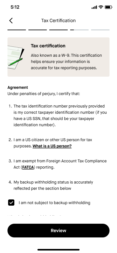
Tax certification
Content goal: Provide a high-level summary of what this legal agreement is to build trust with customers.
Implementation: Highlighted another term (“W-9”) that customers may associate with this agreement. Explained the purpose of the agreement in plain language.
-
![]()
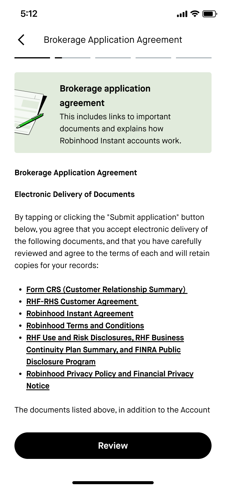
Brokerage application agreement
Content goal: Summarize the purpose of this agreement to cut through the legal jargon and build trust with customers.
Implementation: Flagged to the customer that there will be links to a lot of disclosure documents in this agreement. Highlighted that a significant section of the agreement would focus on explaining how a particular account type works to surface key terms (“Instant Account”) upfront.
-
![]()
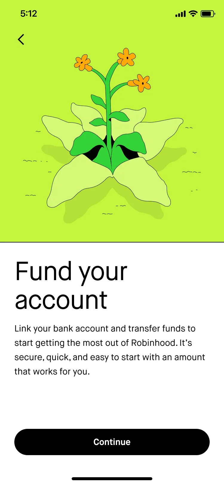
Account funding
Content goal: Encourage the customer to deposit money into their account.
Implementation: User research showed that our customers are wary about funding their account at this stage of the onboarding journey, but removing this step from the flow wasn’t in scope for this project. As a lightweight way of addressing this customer pain point, I tried to encourage customers to fund by highlighting how it will benefit them (“start getting the most out of Robinhood”) and assuaging any concerns they might have about security, time commitment, or account minimums.
-
![]()
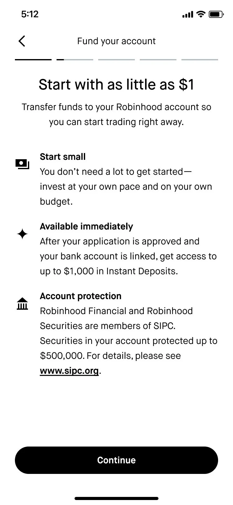
Funding primer
Content goal: Dive into a little more detail to highlight the benefits and address customer concerns around funding during onboarding.
Implementation: “Start with as little as $1” is a value prop that has performed extremely well for us, especially in marketing our fractional shares feature. User research has also shown us that newer investors tend to believe that they need a lot of money to get started investing. I tried to reiterate that the customer is in control in the first bullet with “invest at your own pace and on your own budget.” In the second bullet, I highlighted our Instant Deposits feature, which lets customers access their funds right away. The SIPC language is pretty boilerplate, but positioning it as “account protection” can help chip away at mistrust that the customer may have in our brand.
-
![]()
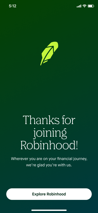
Celebratory conclusion
Once the customer has linked their bank account and transferred funds, they’ll see this screen. (I’m not including the bank linking and funding screens that precede this because they weren’t in scope to change for this project.)
Content goal: Signal to the customer that they’ve completed Robinhood and express appreciation for choosing us.
Implementation: The customer just went through a pretty long flow and trusted us with some of their money, so it felt like a “thank you” was in order. In the subheader, I tried to communicate that everyone is welcome, no matter what their experience level is when it comes to investing. Using “explore” as the primary verb in the CTA invokes excitement and signals that there’s a lot for the customer to dive into.


Outcomes
-
Stat-sig increase in install-to-fund rate
We saw a +5.9% stat-sig increase in install-to-fund rate (the experiment’s core metric) on iOS.
-
Rolled out to 100% on all platforms
After getting positive results on iOS, Android, and web were also updated with these new designs.
-
Served as the foundation for further experiments
This kicked off a series of experiments to the onboarding flow, with all of my content work serving as the foundation of the tone, style, and terminology in the subsequent experiments.